A neutral interior color palette is not the absence of color but the deliberate presence of softened tones. At Takashimaya Interior we treat the warm earth palette — ivory, beige, clay, warm greige, charcoal and muted green — as the foundation of a healing home, where light and material work together to slow the rhythm of daily life.
Why warm neutrals heal
Earthy, warm tones reflect natural light gently, lowering harsh contrast and letting the eye rest. They create continuity between rooms, so a home is experienced as a single calm breath rather than a series of disconnected spaces. Where saturated colors constantly demand attention, warm neutrals step back — making room for people, for the shifting light of the day, and for quiet moments to unfold fully.
In Japanese culture, restraint in color is bound to a meditative spirit and to the practice of hospitality. A space that is visually quiet allows the mind to settle the moment you cross the threshold, and that settling is where healing begins.
Serenity does not come from emptiness, but from placing each tone exactly where it belongs.
Layering tones to avoid flatness
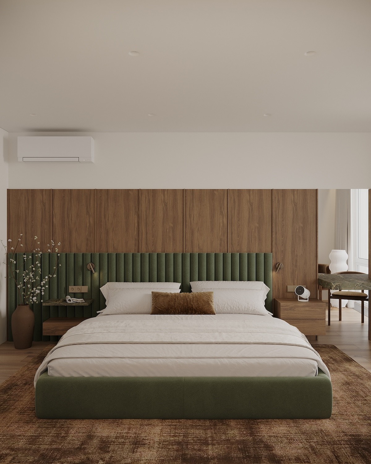
The secret to a living neutral scheme is layering: choose one dominant base tone, then build lighter and deeper values around it. The 70-20-10 rule remains a reliable place to begin.
- 70% base: ivory or warm beige for walls, ceilings and large floors.
- 20% secondary: warm greige or clay for sofas, drapery and rugs.
- 10% accent: charcoal or muted green for frames, ceramics and accessories.
Texture is an invisible color
In a near-monochrome space, texture becomes color. Walnut, slubbed linen, travertine and matte glazed ceramics catch light differently, producing a depth the eye can feel even while the palette stays restrained. Set a rough surface beside a polished one, a coarse weave next to smooth stone — it is this conversation between materials that keeps a room alive.
Let muted green and charcoal lead the depth
A passage of olive-toned green or warm charcoal anchors a room and keeps the palette from drifting into washed-out flatness. Use them on structural moments — a headboard wall, a recessed shelf — so daylight grazes across and reveals their subtle character.
Total coordination in the spirit of Omotenashi
Takashimaya Interior’s Total Coordination begins with one unified palette and extends through furniture, materials and lighting. When every element speaks the same chromatic language, the home greets you each day with a quiet, considered warmth.
We invite you to visit the Takashimaya Interior showroom to touch each material and shape a healing palette for your own home with our team. Book a consultation today.